- iOS 26 revamps the Phone app: A new unified Calls tab merges Favorites, Recents, and Voicemail, creating a cleaner but slightly less intuitive experience for some users.
- Classic layout remains available: You can restore the old design by tapping the three-line menu and choosing Classic, keeping the familiar tab-based layout.
- Unified vs. Classic comparison: The Unified view offers a modern, single-screen call hub, while the Classic view separates tabs for quicker navigation.
- Switching is simple: Apple’s toggle system lets you move between both layouts anytime without losing recent call data or favorites.
Apple’s iOS 26 update gives the Phone app a bold redesign, merging Favorites, Recents, and Voicemail into one unified view. Apple calls it a cleaner and more efficient experience, but many iPhone users say it feels unfamiliar, less intuitive, and slower to navigate.
The good news? Unlike the new Photos app, you don’t have to live with this change. Apple actually lets you switch back to the classic Phone app layout whenever you want. Here’s how it works.
What’s Changed in the iOS 26 Phone App
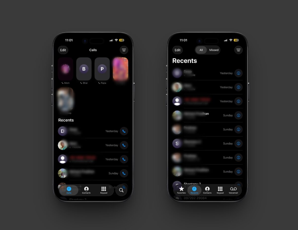
The new Phone app in iOS 26 adopts Apple’s unified design language, bringing Favorites, Recents, and Voicemail together under a single Calls tab. You’ll now see your favorite contacts at the top, followed by recent calls and voicemails in one scrollable view.
It’s a modern, cohesive look but longtime users say it feels less intuitive. If you prefer the old layout, you can read our detailed overview of everything new in the iOS 26 Phone app before deciding which view suits you best.
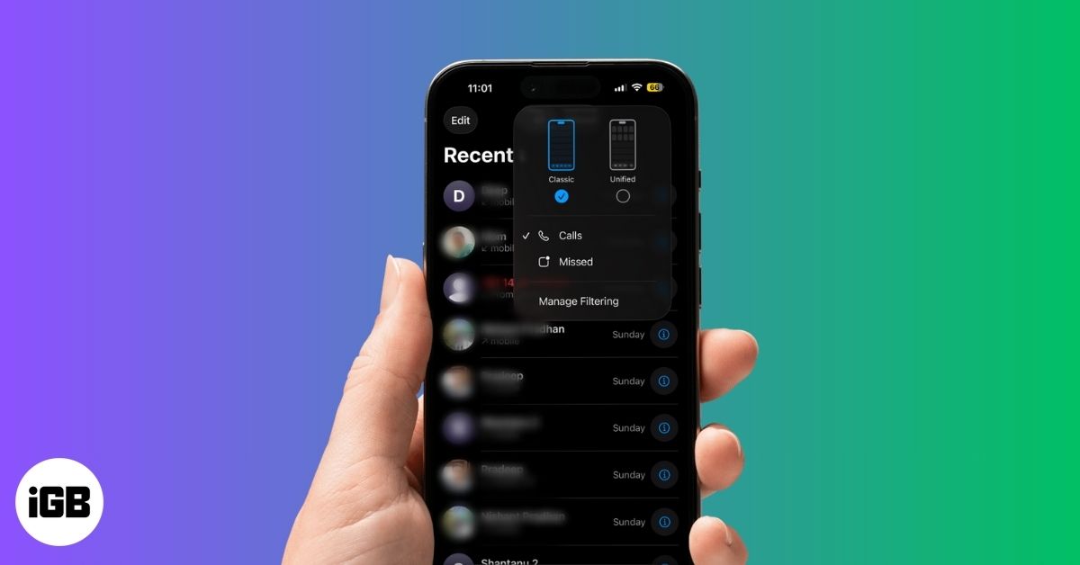
How to Switch Back to the Classic Layout on Your iPhone
After mixed feedback from beta users, Apple quietly added an option to bring back the old tabbed interface. Here’s how to restore the classic Phone app layout in iOS 26:
- Open the Phone app.
- Tap the three lines (☰) button at the top right corner.
- Now, select the Classic layout in the pop-up menu that appears.
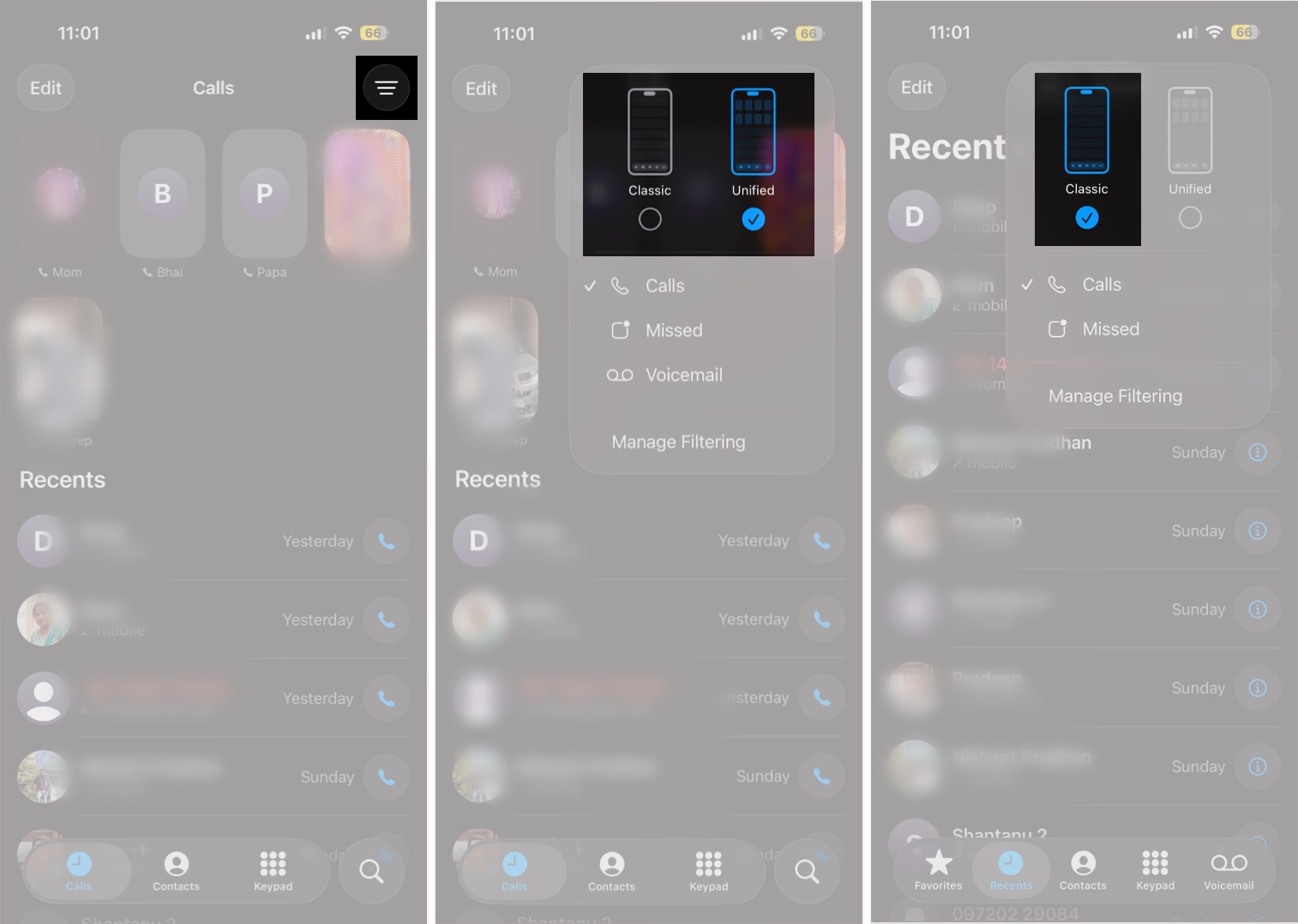
That’s it. Your Phone app will instantly switch back to the familiar layout, complete with the bottom navigation bar showing Favorites, Recents, Contacts, Keypad, and Voicemail, just like before.
Classic vs. Unified Layout: Which One’s Better?
Both layouts have their pros and cons. It really depends on how you use your iPhone.
Classic layout:
- Familiar, easy-to-navigate interface for long-time iPhone users.
- Dedicated tabs for quick access to Favorites, Contacts, and Voicemail.
- Best if you rely on Voicemail or Favorites daily.
Unified layout:
- Modern design that matches the rest of iOS 26.
- All calls and voicemails in one place, reducing tab switching.
- Ideal if you mainly use Recents or prefer a minimalist look.
If you value speed and consistency, the Classic layout still wins. But if you’re all about modern design, the new layout might grow on you over time.
Your iPhone, Your Choice
Apple’s Phone app redesign proves that sometimes, “if it isn’t broken, don’t fix it.” Thankfully, this time Apple listened and gave users control over how their Phone app looks and feels.
So whether you’re team Classic or team Unified, the choice is yours. Switching takes only a few taps, and you can always change it back later.
Have you tried the new Unified layout yet or are you sticking with the classic one? Let us know in the comments.
Related articles worth reading: