
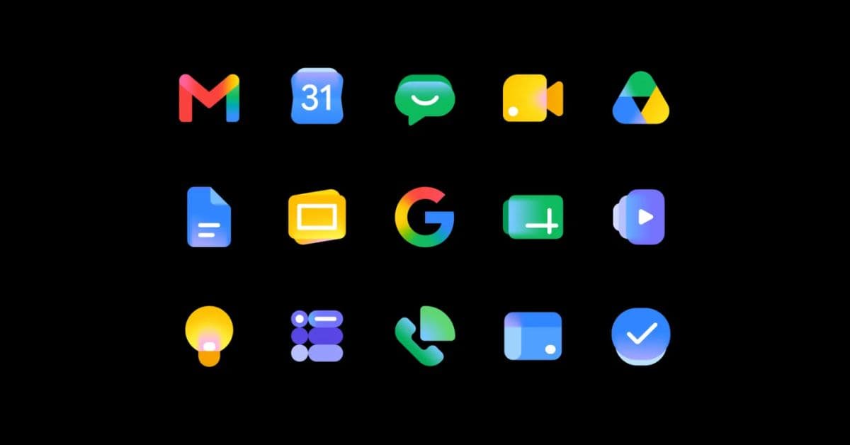
When Google introduced the redesigned Gmail and Workspace icons during I/O 2026, many users immediately noticed the changes. Some icons looked cleaner, some became less colorful, and others completely moved away from the older paper-style design language Google had used for years.
While the company did not discuss the redesign during the keynote itself, Google later explained that the refreshed icons are part of a larger visual shift for the “Gemini Era.”
The redesign is not just about making apps look newer. It reflects how Google now sees Workspace as an AI-focused ecosystem rather than a collection of separate productivity apps.
Google wanted Workspace apps to feel more modern
According to Google, the updated icons introduce a “fresh visual identity” for Workspace. The company says the redesign improves consistency across apps while still keeping each one individually recognizable.
Older Workspace icons had started to feel visually outdated compared to Google’s newer Gemini branding and AI-focused interface designs. Several apps also relied on sharp edges, thick shapes, and similar layouts that no longer matched Google’s current design direction.
With the refresh, Google introduced:
- Softer icon shapes
- Cleaner layouts
- Simpler visual styling
- Reduced visual clutter
For example, apps like Docs, Sheets, Slides, Keep, Forms, Sites, and Vids no longer use the old paper-like background container. Meanwhile, apps such as Meet, Calendar, and Chat now appear less rigid and boxy.
The refreshed icons feel cleaner, lighter, and easier to recognize across Workspace.
Out with the old, in with the bold ✨
— Google Workspace (@GoogleWorkspace)
We gave the Google Workspace icons a sleeker look to meet this new era of helpfulness. Check them out! https://t.co/NHtXdghQys pic.twitter.com/oE3RVs9h7f
The old icons had become difficult to differentiate
Another major reason behind the redesign was recognition. Over the last few years, Google heavily pushed the use of all four Google colors across nearly every Workspace app. While that created visual consistency, it also made many icons look extremely similar.
Users often complained that apps like Docs, Drive, Sheets, Slides, and Meet blended together too easily in crowded app drawers, browser tabs, and multitasking menus.
With the redesign, Google is clearly trying to fix that problem.
Instead of forcing every icon to use the same multicolor styling, the company is giving apps more distinct visual identities. Some icons now rely on fewer colors, while others focus more on shape differentiation rather than color placement alone.
Interestingly, Gmail remains the only major Workspace app that still strongly uses Google’s classic four-color branding. That likely comes down to familiarity, since Gmail remains one of Google’s most recognizable products globally.
Google says the redesign matches its Gemini AI vision
Google repeatedly referred to these refreshed icons as “new logos for the Gemini Era.”
That wording is important because Workspace is rapidly becoming centered around Gemini AI features. During I/O 2026, Google introduced tools like Gmail Live, Docs Live, and new voice-powered AI experiences inside Keep.
Almost every major Workspace app now includes some form of Gemini integration:
- Gmail can summarize emails and generate replies
- Docs can assist with writing
- Meet uses AI-powered note-taking
- Keep is gaining voice AI tools
The refreshed icons also help Workspace feel more connected to Google’s growing Gemini AI push.
Related: These Gemini tricks help me finish long YouTube videos much faster
The redesign is only visual
Google has clarified that the redesigned Workspace icons are purely visual. The update does not change how Gmail or other Workspace apps function.
Features, settings, admin controls, and existing workflows will continue to work exactly as before. The redesign only refreshes the appearance of apps like Gmail, Docs, Meet, Sheets, Slides, Calendar, and others across the Workspace ecosystem.
The rollout of the new icons will happen gradually over the next several weeks.
What the new Workspace redesign tells us about Google
Google’s new Workspace icons make one thing pretty clear: the company wants Workspace to feel more connected than before. Instead of apps looking like separate products, Google is slowly shaping Gmail, Docs, Meet, Keep, and the rest of Workspace into one ecosystem tied closely to Gemini AI.
The redesign also fixes a problem many users had with the older icons. Over time, several Workspace apps started looking too similar because almost every icon used the same colors and a similar visual style. Spotting the right app quickly was becoming harder than it should have been.
With the refreshed look, Google is trying to make apps feel cleaner and more modern while also making them easier to recognize at a glance.
The company repeatedly called these “new logos for the Gemini Era,” which further highlights how important AI has become to Google’s future plans for Workspace.
Google’s new design direction
Google’s redesigned Gmail and Workspace icons are more than just a cosmetic refresh. The new look reflects the company’s push toward a cleaner, more connected Workspace experience built around Gemini AI while also making apps easier to recognize individually.
Do you like Google’s redesigned Gmail and Workspace icons? Tell us in the comments.
You might also like: