Let’s face it: Apple’s Liquid Glass design looked impressive when it debuted. The glass-like transparency made the interface feel more dynamic, immersive, and visually consistent across Apple’s ecosystem. However, many users quickly discovered that the design came with trade-offs. Navigation bars, menus, and other interface elements could be difficult to read, especially against busy backgrounds.
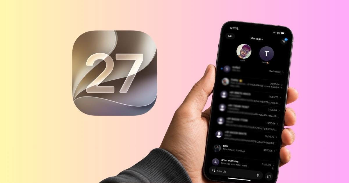
With iOS 27 and macOS 27, Apple is finally addressing those complaints. A new Liquid Glass transparency slider allows users to control how transparent the interface appears, making it easier to strike a balance between aesthetics and usability.
Here’s how to customize Liquid Glass on iPhone, iPad, and Mac.
What is Liquid Glass and why did users dislike it?
Liquid Glass is Apple’s glass-inspired interface system that adds transparency, depth, reflections, and layered visual effects throughout iPhone, iPad, and Mac software. Apple introduced it to create a more immersive and cohesive design system across devices.
The problem wasn’t that Liquid Glass looked bad. But it focused too much on aesthetics rather than usability.
Navigation bars blended into backgrounds, and text became harder to read. Many third-party apps didn’t fully adopt the design. Some users found the constant transparency distracting, especially in Dark mode. Also, I noticed the visual effects affected performance and battery on older devices.
The biggest frustration was that after much backlash, Apple added Clear and Tinted options in later iOS 26 updates. But there was no middle ground. You either accepted Apple’s vision or used a workaround to tone down the transparency. There was very little room for personal preference. And that’s what made Liquid Glass feel more like a design mandate.
iOS 27 adds a new Liquid Glass transparency slider
With iOS 27 and macOS 27, Apple is finally treating Liquid Glass as a preference. The new slider allows users to adjust transparency levels across the system in real time. Instead of choosing binary Clear and Tinted, you can move along a spectrum ranging from highly transparent to heavily tinted. The live preview helps you decide what suits your taste.
Compared to iOS 26, the visual differences are immediately noticeable:
- Navigation bars become easier to distinguish from content.
- Search fields gain stronger contrast.
- App backgrounds look less distracting.
- Menus appear more solid and readable.
- Transparent elements can be dialed back without removing the design entirely.
- Icons appear sharper and more defined than before with a subtle glow.
What I like most about this approach is that Apple didn’t abandon Liquid Glass. Instead, the company acknowledged that different people want different levels of visual intensity.
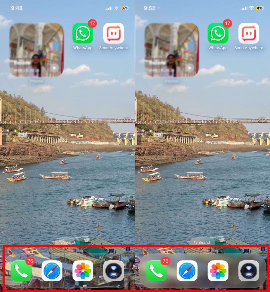
I have customized Liquid Glass to be clearer on my iPhone and see how the dock shows the wallpaper underneath perfectly, with some warping effect. The search button is almost invisible.
Also, the address bar in Safari adapts the background beautifully. Similarly, menus and buttons in other apps and the notification banner have become pellucid.
How to change Liquid Glass transparency on iOS 27 and macOS 27
To get the new liquid glass controls, you need to install iOS 27 and macOS 27 developer beta accordingly.
On iPhone and iPad
Apple has placed the new control exactly where most users would expect it.
- Open Settings.
- Scroll down and tap Appearance.
- Select Liquid Glass.
- By default, it’s in balanced mode. Move the transparency slider towards the right to increase opacity. To make the elements more see-through, drag them towards the left.
- Preview changes instantly before leaving the page.
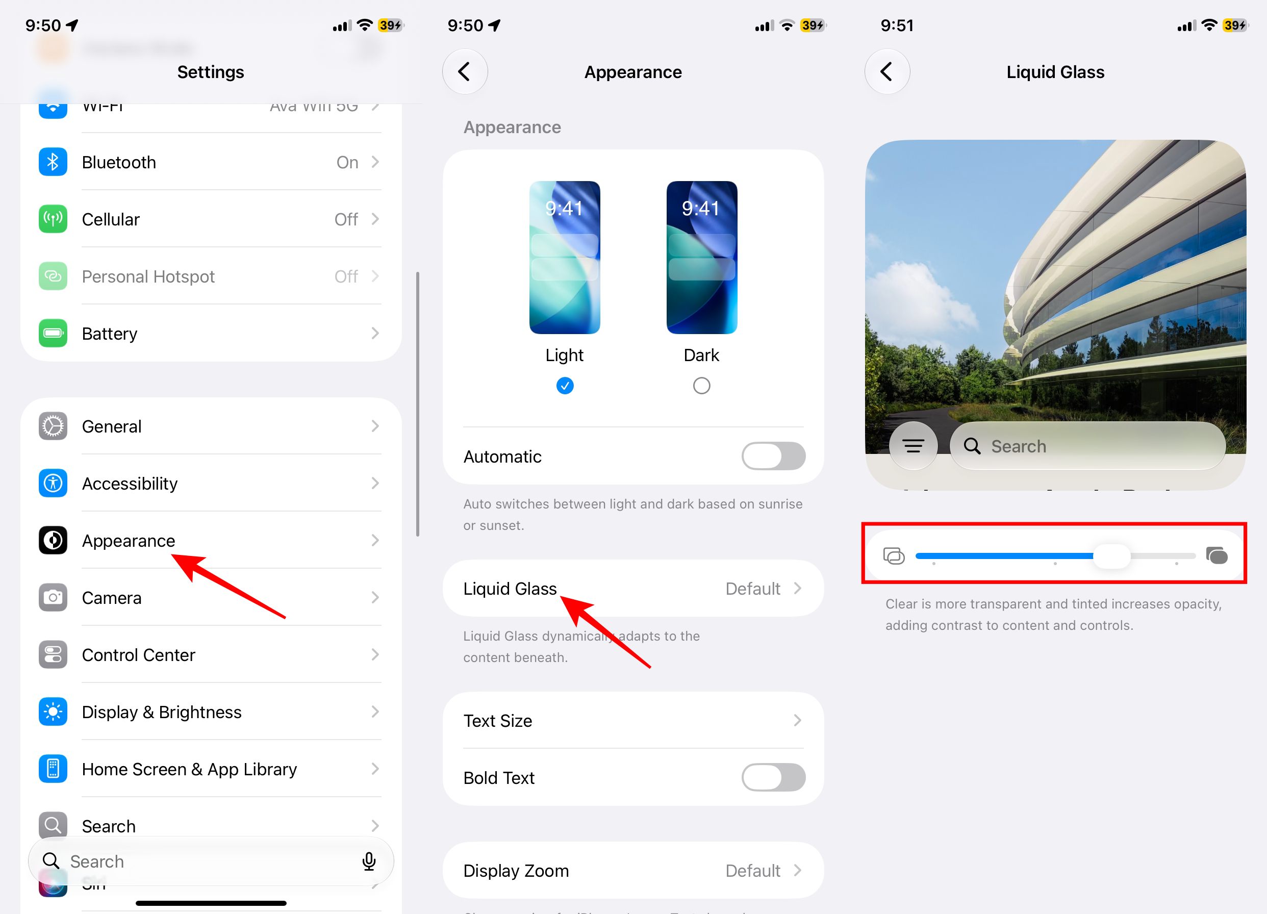
If you had a hard time identifying navigation bars, keep Liquid Glass more tinted to make interface elements easier to separate from the background content.
On Mac
The process is almost identical in macOS 27.
- Go to the Apple menu and open System Settings.
- Navigate to Appearance.
- Under the Liquid Glass section, adjust the transparency slider to your preference.
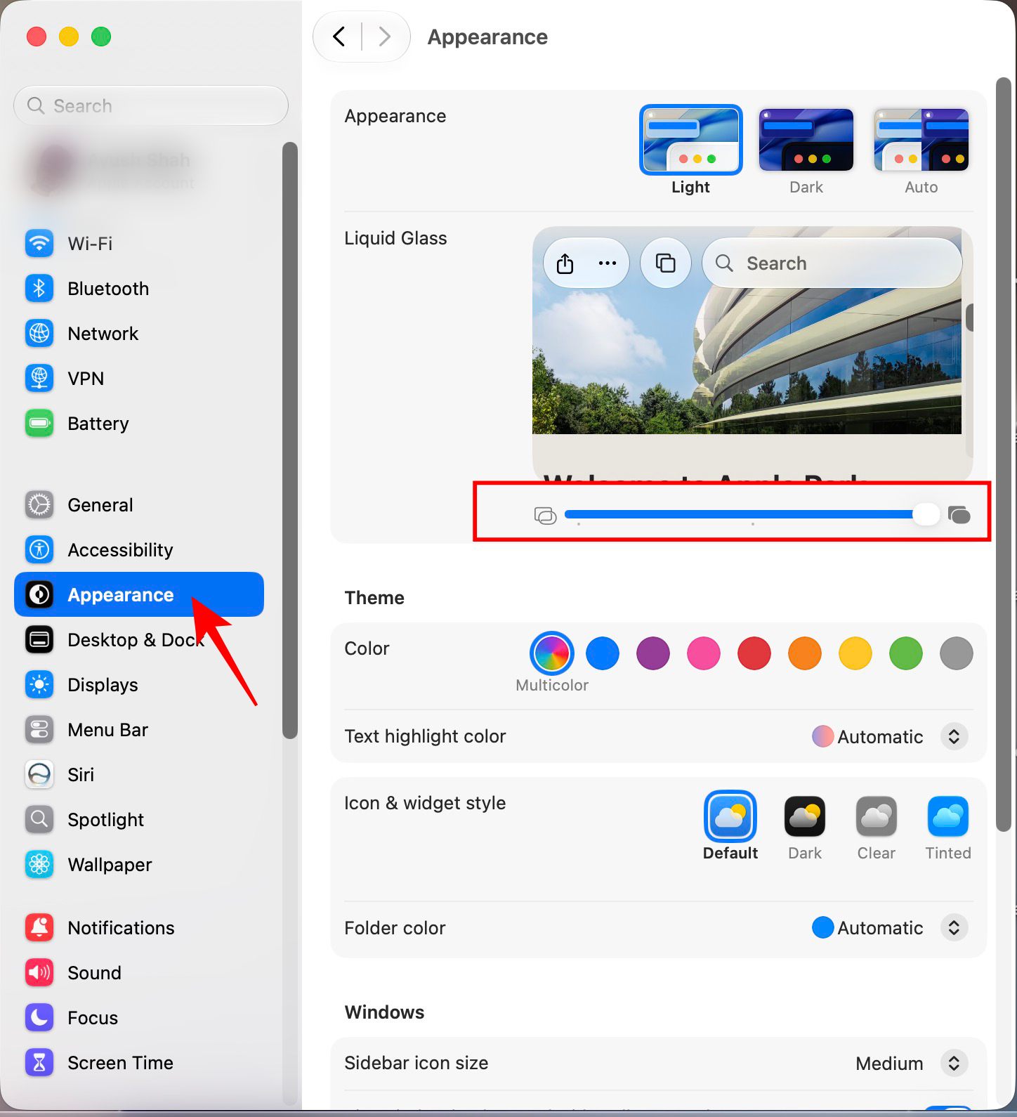

Apple has intentionally kept the experience consistent across devices, which means once you learn it on an iPhone, you’ll immediately understand it on a Mac as well.
Other Liquid Glass improvements in iOS 27
The slider is getting most of the attention, but it isn’t the only improvement. Apple has also refined the way Liquid Glass behaves throughout the operating system.
Text readability has improved thanks to improved diffusion, darkened edges, and smarter separation between foreground and background elements. Floating bars, top-layer icons, and windows now maintain stronger contrast when content scrolls beneath them.
Icons have been redesigned to appear sharper and easier to distinguish. Apple has also reduced some of the more controversial visual tricks that made icons appear tilted or visually distorted on certain screens.
Taken together, these changes make Liquid Glass feel less experimental and more mature.
Who should change their Liquid Glass transparency?
You should probably reduce transparency if you:
- Prioritize readability over visual effects.
- Frequently use your device outdoors.
- Find transparent menus distracting.
- Have accessibility needs that benefit from stronger contrast.
You may prefer the default or more transparent settings if you:
- Enjoy Apple’s modern design language.
- Want the most visually dynamic interface possible.
- Like seeing more of your wallpaper and app content through system elements.
For most people, I suspect the sweet spot will be somewhere in the middle. Enough transparency to preserve the design, but enough tint to improve clarity.
Apple finally gives users a choice
Apple deserves credit for listening to user feedback. The company could have easily doubled down on Liquid Glass and insisted that users adapt. Instead, it acknowledged that good design isn’t just about visuals. It’s also about flexibility.
The new transparency slider is exactly the kind of customization many users wanted from the start. Liquid Glass remains a core part of Apple’s design language, but users now have far more control over how prominent the effect appears across the system. Combined with improved readability, stronger contrast, and sharper icons, the interface feels considerably more polished than before.
For most people, the ideal setting will likely be somewhere in the middle: enough transparency to preserve the visual appeal of Liquid Glass, but enough tint to make menus, navigation bars, and buttons easier to see.
Do you prefer the original Liquid Glass look, or will you be dialing back the transparency in iOS 27? Let us know in the comments below.
You may like to read: