
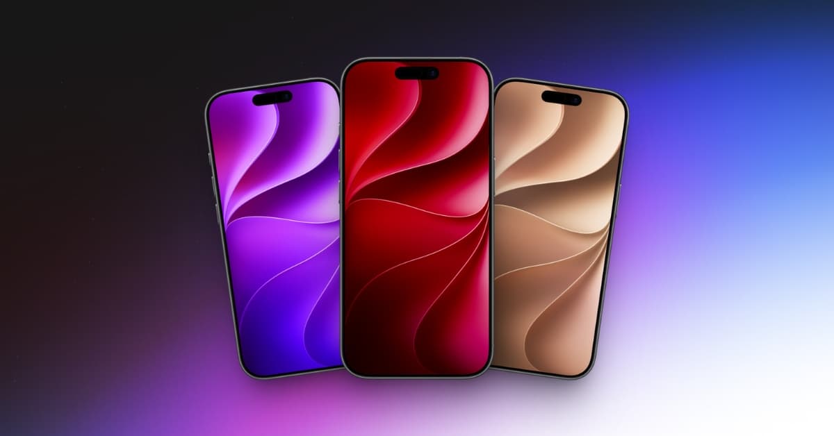
Apple’s official iOS 27 wallpapers are finally here, and this year, there is more than just one design to choose from. The new Celosia wallpaper collection comes in several stunning color variations.
I have always felt that Apple wallpapers are more than just backgrounds. They often reflect the visual identity of the operating system, and the iOS 27 wallpaper is a perfect example. Its flowing layers, soft shadows, and overlapping curves beautifully complement Apple’s refined Liquid Glass design language.
The best part? You don’t need to install iOS 27 to enjoy them. Here, you can preview and download all the official iOS 27 wallpapers in high resolution for free.
iOS 27 brings Celosia design
At first glance, the iOS 27 wallpaper looks like a simple abstract composition. But the longer I look at it, the more details I notice.
The design, called Celosia, features sweeping curves, overlapping layers, and soft shadows that create a sense of depth. Depending on the color, it looks like folded paper, layered flower petals, or translucent sheets overlapping. Whether I want a bright Home Screen, a minimal neutral setup, or a darker look, there is a variation for almost every style.
There’s also a subtle detail hidden in the design. If you look closely at the shapes and curves, the pattern appears to be inspired by the numbers 2 and 7, representing iOS 27.
More importantly, the wallpaper fits perfectly with iOS 27’s refined Liquid Glass aesthetic. Instead of relying on loud colors or aggressive gradients, Apple uses depth, shadows, and layered elements to create a design that feels elegant and modern.
Download official iOS 27 wallpapers in all colors
The official iOS 27 wallpaper collection is available in multiple beautiful color variations in both Light and Dark mode. Simply tap the Download button below your preferred wallpaper and save the full-resolution image to your device. I sourced these wallpapers from iClarified.
Note:
The official iOS 27 wallpaper collection is designed for iPhone, but you can also use these high-resolution wallpapers on Android phones and other devices.
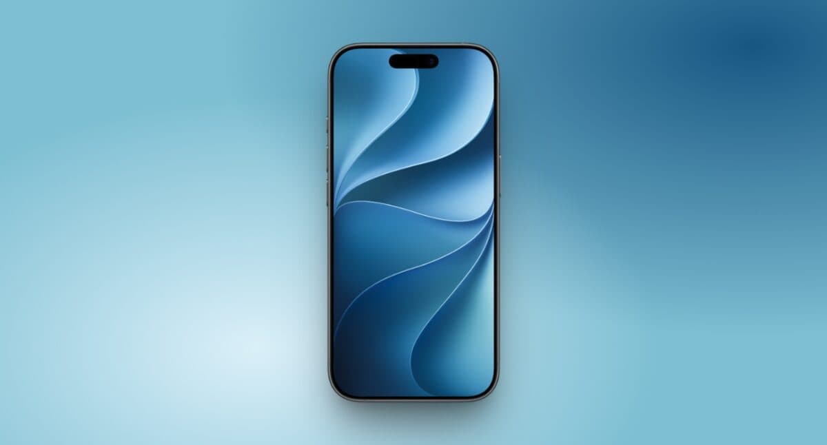
Blue wallpaper
The Blue version is one of the cleanest and most recognizable wallpapers in the collection. It gives the Celosia design a fresh and vibrant look while keeping the overall aesthetic minimal and refined. I particularly like pairing it with monochrome app icons, which complement the blue background without making the home screen feel too busy.
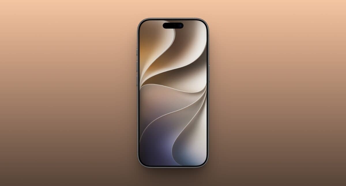
Gold wallpaper
The Gold variation gives the Celosia design a warmer and more premium appearance. It’s one of my favorite options if you want something bright and eye-catching while still maintaining a sophisticated and refined look.
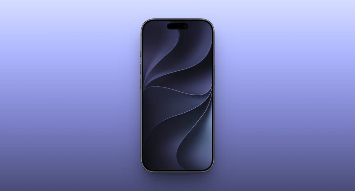
Ink wallpaper
The Ink version uses deeper and richer tones to create a dramatic look. Its darker palette helps emphasize the overlapping curves in the design, making it a great option for users who prefer a darker aesthetic without opting for a completely black wallpaper.
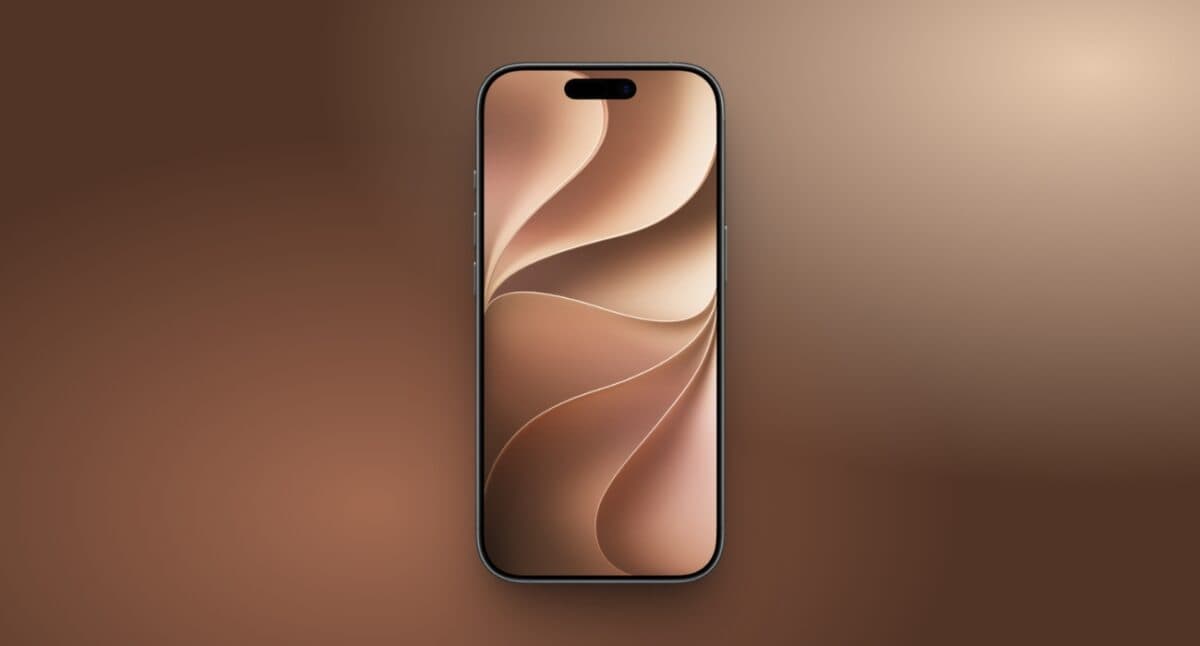
Brown wallpaper
The Brown variation gives Apple’s futuristic wallpaper design a surprisingly warm and natural feel. I like how the richer tones add more depth to the abstract Celosia design while maintaining a warm, sophisticated aesthetic.
Slate gray wallpaper
Slate Gray is probably the most minimal and versatile option in the entire collection. Its neutral tones allow the Celosia pattern to stand out without making the screen feel overly colorful. I think this wallpaper works particularly well with monochrome app icons or for anyone who prefers a clean, professional-looking Home Screen.
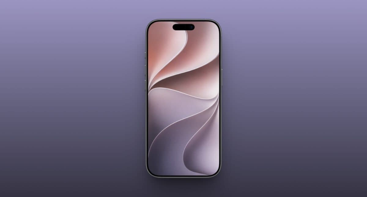
Bonus iOS 27 wallpapers: Blood red, purple, and teal
Beyond the standard iOS 27 wallpaper collection, there are also some special color versions that match certain iPhone colors.
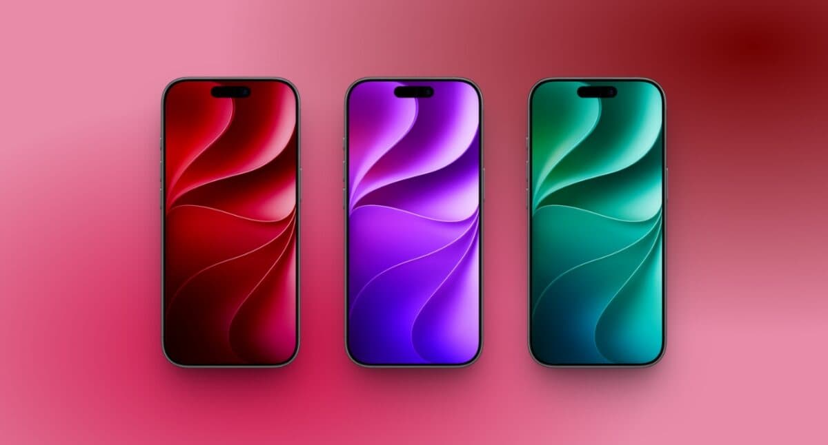
Download wallpaper: Blood Red | Purple | Teal
Shared by @aan__x, the Blood Red, Purple, and Teal versions use the same signature Celosia design but are tuned to visually match their corresponding iPhone colors. This gives the wallpaper and the physical device a more coordinated look. I particularly like this approach because the wallpaper doesn’t feel like a random color variation.
Which iOS 27 wallpaper color should you choose?
With so many variations available, choosing the right wallpaper really comes down to your personal style.
Here’s my quick recommendation:
| My pick | Best for |
|---|---|
| Gold | A premium and elegant look |
| Dark Ink | The ultimate Dark Mode setup |
| Slate Gray | A clean and minimal Home Screen |
| Teal | A fresh look that complements a matching iPhone |
| Blood Red | A bold and eye-catching Lock Screen |
Personally, I would rotate between Gold during the day and Dark Ink at night. The two wallpapers feel completely different while still maintaining the same iOS 27 design language.
Final thoughts
The iOS 27 wallpaper collection is one of Apple’s most versatile wallpaper releases in recent years. Instead of giving users a single default background, the Celosia design is available in a wide range of colors, making it easy to personalize your iPhone without moving away from Apple’s official aesthetic.
Whether you’re already running iOS 27 or simply want to give your iPhone a fresh look without installing the update, these wallpapers are definitely worth downloading.
Which iOS 27 wallpaper color is your favorite? I’d personally love to know which one you would pick for your iPhone.
Must Like: