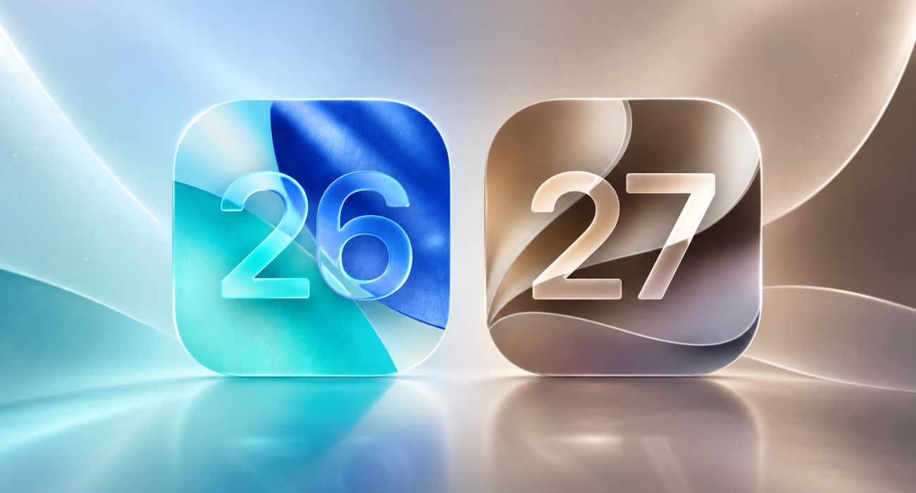
Normally, when Apple and Google release new versions of their operating systems, the buzz is all about new features, who copied whom, and what AI trickery is packed in. However, with iOS 26 and Android 16, all eyes are on the looks and aesthetics. From iOS’s glass-like layers to Android’s expressive colors, 2025 is shaping up to be the year where design takes the front seat.
And while both platforms have added some practical features here and there, the headline feature on both platforms this year revolves around design.
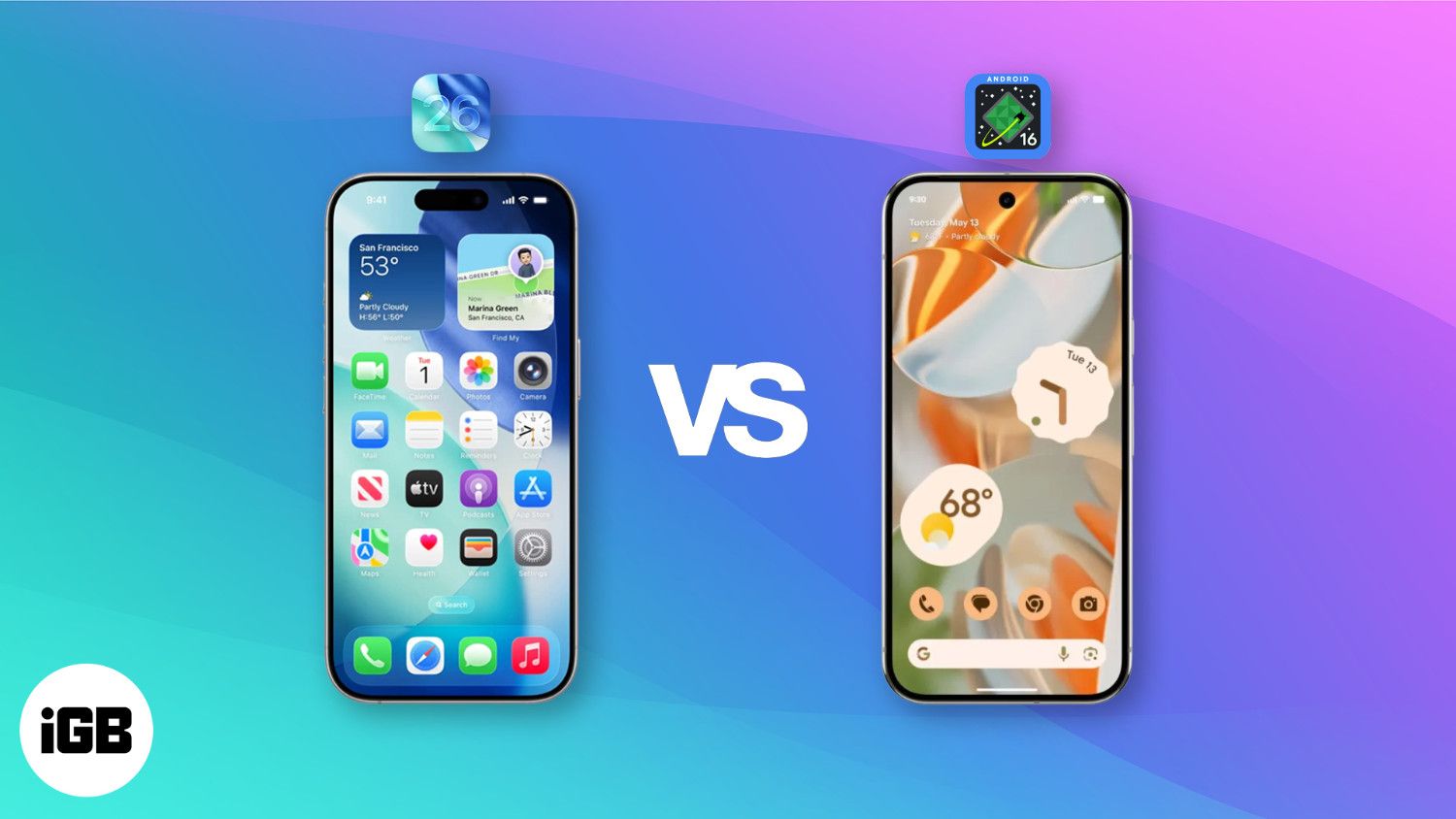
iOS 26 vs Android 16: Feature Comparison (Design Aside)
Before diving into the visual changes, let’s take a moment to compare the actual features these updates bring to the table.
What’s New on iOS 26?
Apple has finally introduced some features that Android users have had for years:
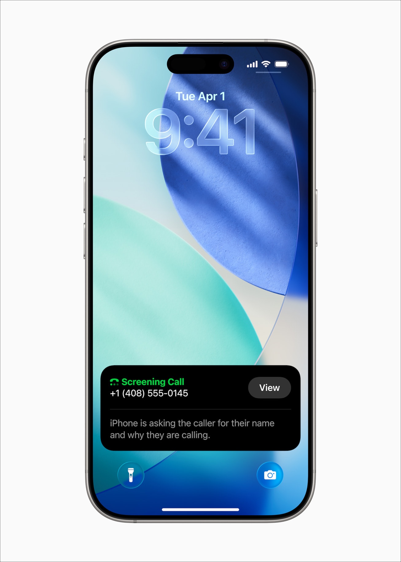
- Call Screening: It picks up unknown calls automatically, asks who’s calling and why, and then shows you a transcript so you can decide whether to answer. Pixel phones have been doing this since 2018.
- Hold Assist: Your iPhone now waits on hold for you and sends a notification when a real person joins the call. It works just like Google’s Hold for Me on Pixel phones.
- Visual Intelligence: Building on last year’s update, Visual Intelligence now works with what’s on your screen, too. It’s Apple’s take on Google’s Circle to Search feature.
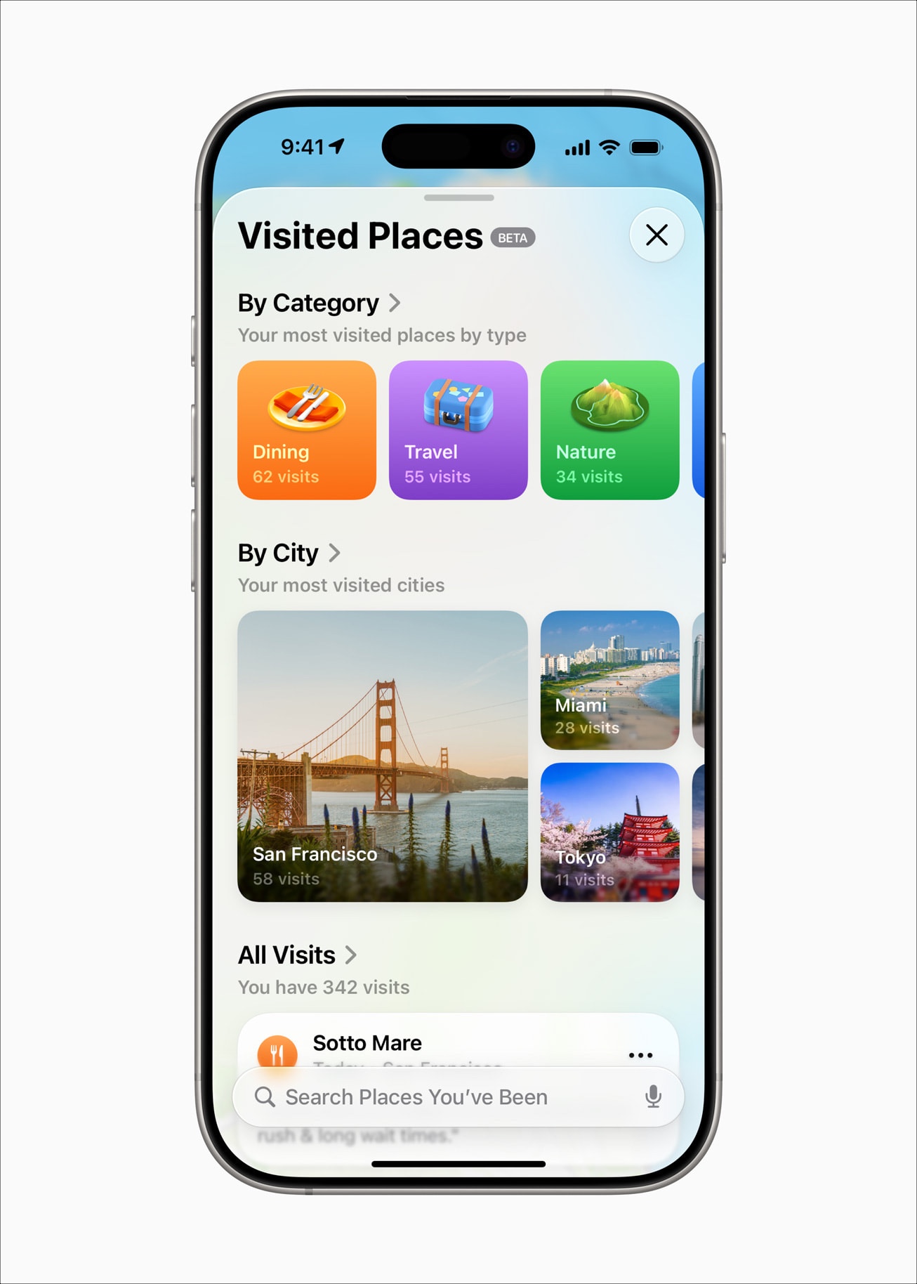
- Visited Places: Tracks the places you’ve been and organizes them inside Apple Maps—similar to Google Maps Timeline, but more focused on location highlights.
- Messages Updates: You can personalize chats with custom backgrounds, run polls in group messages, and send or receive Apple Cash within conversations.
- Apple Intelligence: Adds AI upgrades to Image Playground, Genmoji, and Live Translate. Most of the features are already possible on Android with the help of Gemini.
For more details, check out our detailed guide on iOS 26 features.
What’s New in Android 16?
On the other hand, while Android is bringing new features, most of them are niche and may only be useful for power users:
- Desktop Windowing: Lets you run multiple apps in resizable windows on large screens like tablets or foldables, just like a desktop setup.
- Custom Keyboard Shortcuts: Set up personalized keyboard commands to launch apps or perform actions—great for productivity on tablets.
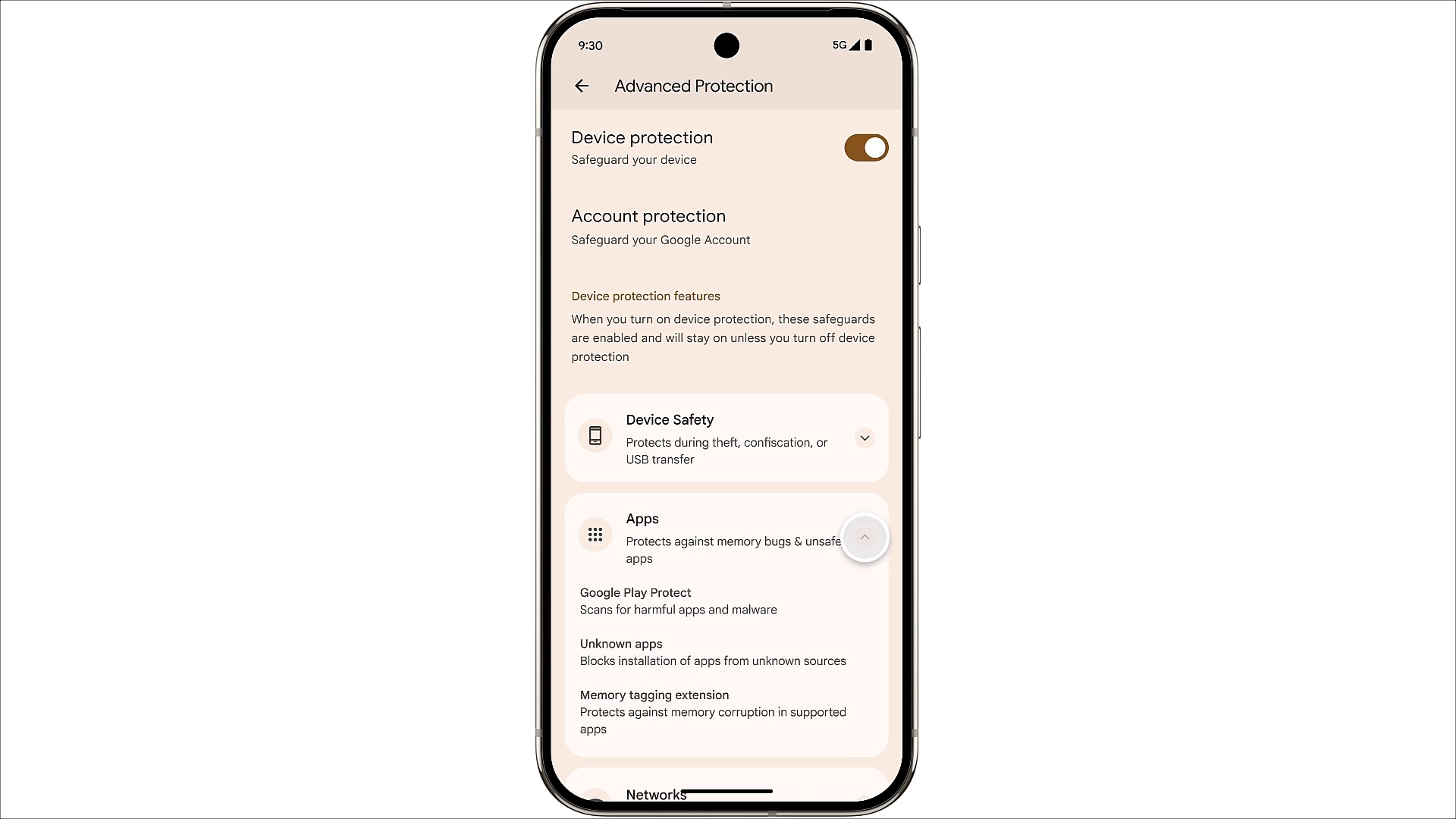
- Advanced Protection: A new all-in-one security hub that helps you stay protected from scam calls, risky apps, and account takeovers with a single tap.
- Auto-Grouped Notifications: Automatically bundles similar alerts to reduce clutter and make it easier to focus on what matters.
- Predictive Back Gesture: Shows a preview of your previous screen before you swipe back, giving you more control over navigation.
- Taskbar Overflow: Manage multiple open apps and find the window you need quickly with the new taskbar overflow feature.
- Haptic Sliders: Adds physical-like feedback when adjusting volume or brightness, so changes feel more precise.
- Adaptive Refresh Rate: Automatically adjusts the screen’s refresh rate based on what you’re doing—high for games, low for reading—to save battery.
In short, both Apple and Google are adding new features. While Apple’s updates feel more noticeable and useful for everyday users, most of them already exist on Android—Apple is simply catching up. Meanwhile, Android 16 introduces more advanced tools, but they’re niche and unlikely to impact the average user. Neither OS offers a feature that significantly changes how you use your phone on a day-to-day basis.
But as mentioned, the major headline change this year on both platforms is design.
Design Spotlight: Liquid Glass vs Material 3 Expressive
Okay, now let’s talk about what actually feels new this year—the look. Both Apple and Google brought their own style to the table.
iOS 26: Liquid Glass

Liquid Glass is Apple’s new design language introduced across iOS 26, iPadOS 26, macOS Tahoe, watchOS 26, and tvOS 26. It gives the interface a dynamic, glass-like appearance with effects that mimic real-world transparency, layering, and reflections.
This design adds depth and motion to everyday UI elements, enhancing their visual appeal. App icons, widgets, buttons, and menus appear as if they are made of layered frosted glass. They reflect the surrounding content and light, adjusting in real time depending on what you’re viewing. Translucent surfaces catch highlights, morph as you scroll or swipe, and transition smoothly between light and dark modes based on context.
Android 16: Material 3 Expressive

Material 3 Expressive is Google’s updated design language built on top of Material You. Google’s design approach is all about color, personalization, and comfort. While Material You concentrated more on bringing wallpaper colors to your UI, Material 3 Expressive gives you and app developers more freedom to experiment with colors.
It brings bold colors, irregular shapes, soft corners, and clear typography. Google is prioritizing layouts that are more fun, unique, and readable.
Material 3 Expressive also emphasizes playful visual feedback. When you dismiss a notification or interact with elements like volume sliders or app previews, the motion feels springy and responsive.
Real Talk: Our Take on the New Designs
Apple’s Liquid Glass looks impressive at first glance, but quickly becomes a distraction. Elements blend too much. Text and icons sometimes lose contrast. It feels a bit too eager to impress and ends up becoming more clumsy. More often than not, I find myself squinting to open an app or adjust any control from the Control Center.

Material 3 Expressive, on the other hand, is still not fully rolled out. Based on what we’ve seen so far and Google’s track record with Material You, the vision sounds more promising than the actual delivery. That said, it leans more toward readability and user comfort, which makes it more promising.

Verdict: Apple went hard on the visuals, but it might be too much. Google is playing it safe, and that might just work better. Preferring one design over another is subjective, but in terms of usability, we believe Google’s design takes the lead, whereas Apple’s Liquid Glass requires some refinement and may need to reduce transparency in certain areas.
Related: Not a Fan of iOS 26’s Liquid Glass Look? Here’s How to Tone It Down
Final Thoughts: 2025 Is the Year of Form Over Function
If you’re hoping for meaningful new features this year, you might walk away a little disappointed. But if design matters to you, this is the year to pay attention. This will be how both companies move forward with their design style over the next few years.
iOS 26 and Android 16 are both good in their own ways, but this time, the fight isn’t about doing more. It’s about how things look while doing it. That’s why 2025 is clearly the year of form over function.
Related articles worth reading: