Leaked Prototype Confirms Apple Considered iMac Logo Placement
Apple’s 2021 iMac redesign dropped the iconic front logo, but not without debate. A new leak reveals Apple tested logo placements before settling on a cleaner, logo-free look.
- Apple dropped the front logo on the 2021 iMac to highlight a cleaner look and embrace the minimalism trend seen across its latest hardware.
- Early iMac prototypes included a front logo, showing Apple originally considered multiple branding placements before settling on the current bare-front design.
- Minimalist design caters to younger aesthetics, with Apple favoring subtle branding and a more modern, decor-friendly profile for home setups.
- Design decisions stem from extensive internal testing, with logo placement among the many tweaks that shift during prototype phases.
- No front logo doesn’t mean it’s gone forever. Apple may revive visible branding on future iMacs, depending on design trends or market feedback.
Apple’s 2021 iMac redesign marked a major departure from previous generations, introducing vibrant color options, an ultra-slim chassis, and Apple Silicon for the first time in the lineup. But longtime users quickly noticed what wasn’t there: the familiar Apple logo that used to sit prominently on the front chin below the display.
Prototypes Reveal Logo Was Considered
While the absence of the front logo seemed like a bold aesthetic choice, it wasn’t a spontaneous one. A recent post by leaker Kosutami on X (formerly Twitter) shared a behind-the-scenes glimpse into early prototypes of the 24-inch iMac. One version reportedly included the Apple logo on the front, suggesting that Apple seriously weighed the decision before going in another direction.
In the final version, the logo was moved solely to the back, leaving the front panel minimal and logo-free. That design shift signals a clear intent by Apple to modernize the look while reducing brand clutter.
Design Shift Toward Visual Simplicity
The decision lines up with a broader trend in Apple’s hardware design: embracing cleaner lines and a minimalist presentation. The colorful finishes on the 2021 iMac already act as visual branding in themselves, perhaps making a front-facing logo feel redundant. It’s a calculated move that seems aimed at younger demographics, especially Gen Z buyers, who often favor understated design over overt branding.
How Apple Iterates Behind the Scenes
Kosutami’s leak underscores how Apple doesn’t land on a final design lightly. Each product reportedly goes through dozens of iterations, many of which never reach the public. While that level of control is nothing new, it’s rare to get a glimpse at these discarded variants.
It also leaves the door open for Apple to bring the logo back if design trends shift again or if a future iMac iteration calls for it. For now, the logo-free front appears to be a calculated statement.
Is a cleaner front worth the loss of the iconic logo? Or do you think the branding helped ground the iMac’s identity? Sound off in the comments below.
Don’t miss these related reads:

Written by
VikhyatVikhyat has a bachelor's degree in Electronic and Communication Engineering and over five years of writing experience. His passion for technology and Apple products led him to the tech writing space, where he specializes in writing App features, How-to guides, and troubleshooting guides for fellow Apple users. When not typing away on his MacBook Pro, he loves exploring the real world.
View all posts →More from News
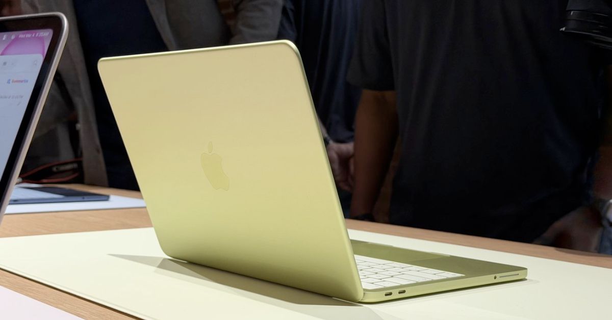
First MacBook Neo Benchmarks Reveal Power of Apple’s A18 Pro Chip
The first MacBook Neo benchmarks are now online, revealing how Apple’s A18 Pro chip performs inside a laptop. Early results show impressive single-core performance that even surpasses the original M1 MacBook Air.
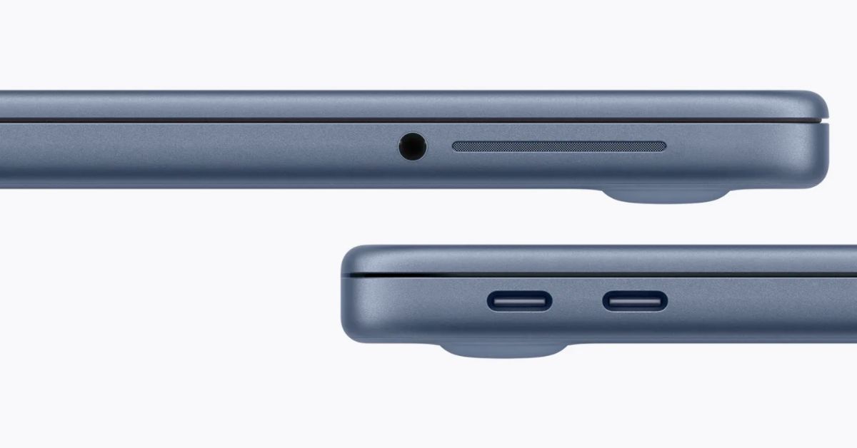
macOS Will Flag the Slower USB-C Port on MacBook Neo
The MacBook Neo includes two USB-C ports with different capabilities. The left port supports faster speeds and external displays, while the right port is limited to USB 2 speeds for charging and basic accessories.

Apple Launched Studio Display and Studio Display XDR: Full Specs, Features, and Price
Apple launches Studio Display and Studio Display XDR built for creators with Thunderbolt 5, stunning visuals, and pro-level performance. Here’s all the specs, features, and price.