FaceTime Like a Pro
Get our exclusive Ultimate FaceTime Guide 📚 — absolutely FREE when you sign up for our newsletter below.

FaceTime Like a Pro
Get our exclusive Ultimate FaceTime Guide 📚 — absolutely FREE when you sign up for our newsletter below.
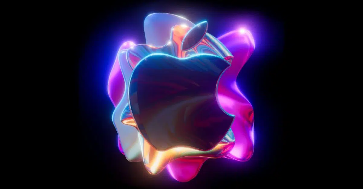
Apple’s 2021 iMac redesign dropped the iconic front logo, but not without debate. A new leak reveals Apple tested logo placements before settling on a cleaner, logo-free look.
Apple’s 2021 iMac redesign marked a major departure from previous generations, introducing vibrant color options, an ultra-slim chassis, and Apple Silicon for the first time in the lineup. But longtime users quickly noticed what wasn’t there: the familiar Apple logo that used to sit prominently on the front chin below the display.
While the absence of the front logo seemed like a bold aesthetic choice, it wasn’t a spontaneous one. A recent post by leaker Kosutami on X (formerly Twitter) shared a behind-the-scenes glimpse into early prototypes of the 24-inch iMac. One version reportedly included the Apple logo on the front, suggesting that Apple seriously weighed the decision before going in another direction.
In the final version, the logo was moved solely to the back, leaving the front panel minimal and logo-free. That design shift signals a clear intent by Apple to modernize the look while reducing brand clutter.
The decision lines up with a broader trend in Apple’s hardware design: embracing cleaner lines and a minimalist presentation. The colorful finishes on the 2021 iMac already act as visual branding in themselves, perhaps making a front-facing logo feel redundant. It’s a calculated move that seems aimed at younger demographics, especially Gen Z buyers, who often favor understated design over overt branding.
Kosutami’s leak underscores how Apple doesn’t land on a final design lightly. Each product reportedly goes through dozens of iterations, many of which never reach the public. While that level of control is nothing new, it’s rare to get a glimpse at these discarded variants.
It also leaves the door open for Apple to bring the logo back if design trends shift again or if a future iMac iteration calls for it. For now, the logo-free front appears to be a calculated statement.
Is a cleaner front worth the loss of the iconic logo? Or do you think the branding helped ground the iMac’s identity? Sound off in the comments below.
Don’t miss these related reads: