Not a Fan of iOS 26’s Liquid Glass Look? Here’s How to Tone It Down
Don’t like the new Liquid Glass effect in iOS 26? Here’s how to disable or reduce the visual intensity for a cleaner, distraction-free iPhone experience.
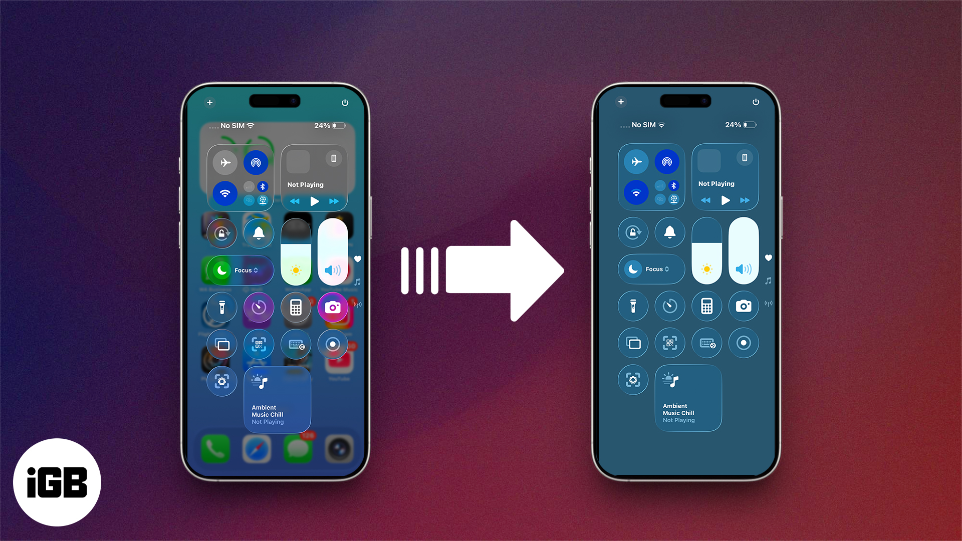
iOS 26 introduces the biggest visual redesign to the iPhone in over a decade. Called Liquid Glass, this new design language brings translucent layers, dynamic motion, and glass-like reflections to almost every corner of the system—from app icons and widgets to control panels and menus. It looks stunning and futuristic, but let’s be honest: not everyone loves it.
For some users, the new look can feel too glossy, distracting, or hard to read. If you’re one of them, the good news is you don’t have to live with it exactly as is. There are ways to tone it down.
How to Reduce Transparency in iOS 26
If you’re finding the new design too hard on the eyes, the quickest fix is to enable Reduce Transparency. It doesn’t remove Liquid Glass completely but makes everything less see-through and easier to read.
Here’s how:
- Open the Settings app.
- Tap Accessibility.
- Go to Display & Text Size.
- Toggle on Reduce Transparency.
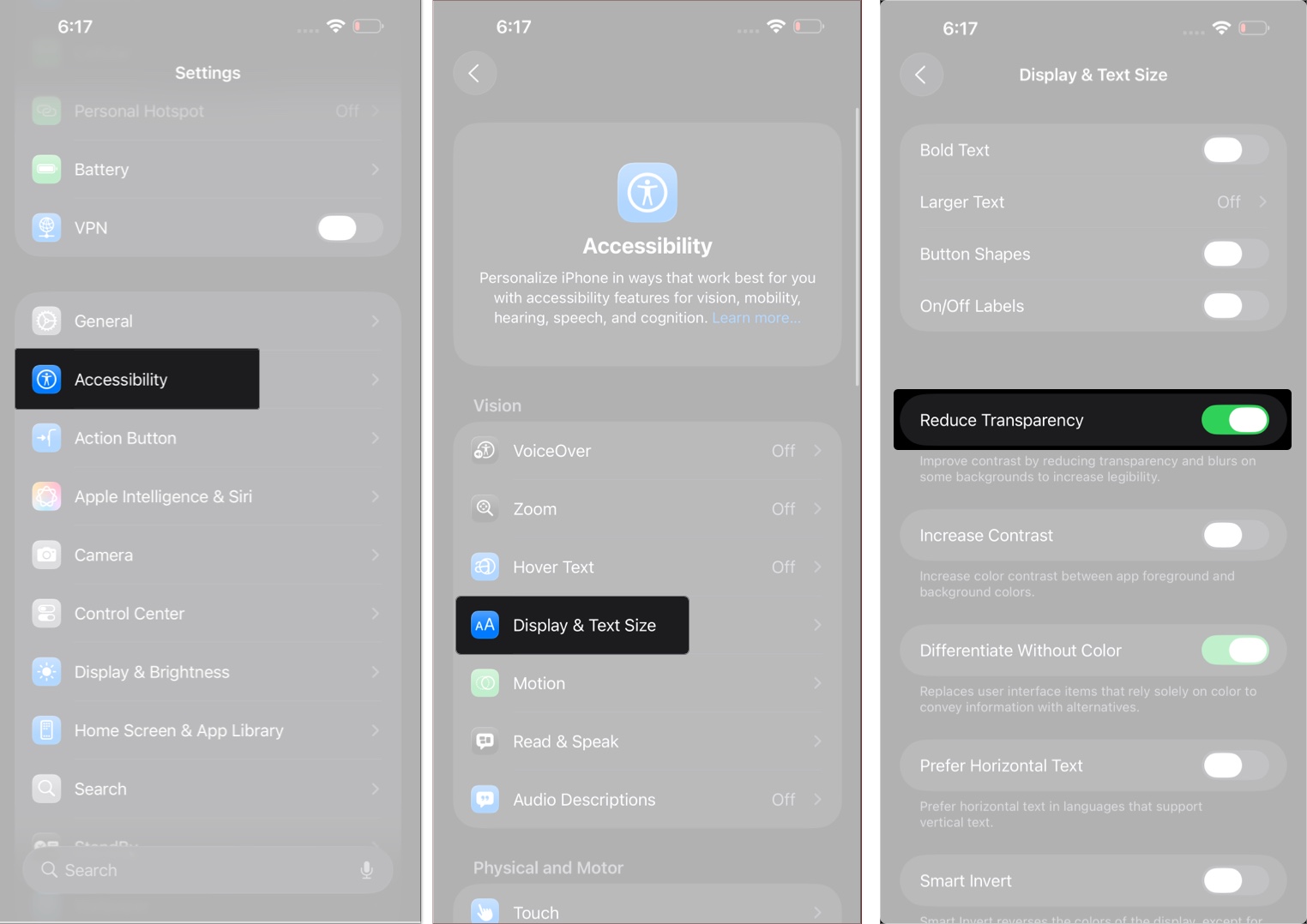
Once enabled, UI elements such as Control Center, app folders, and icons will have darker, more solid backgrounds, improving contrast and readability.
You can also assign this to an Accessibility Shortcut for quick toggling via the side button or Control Center.
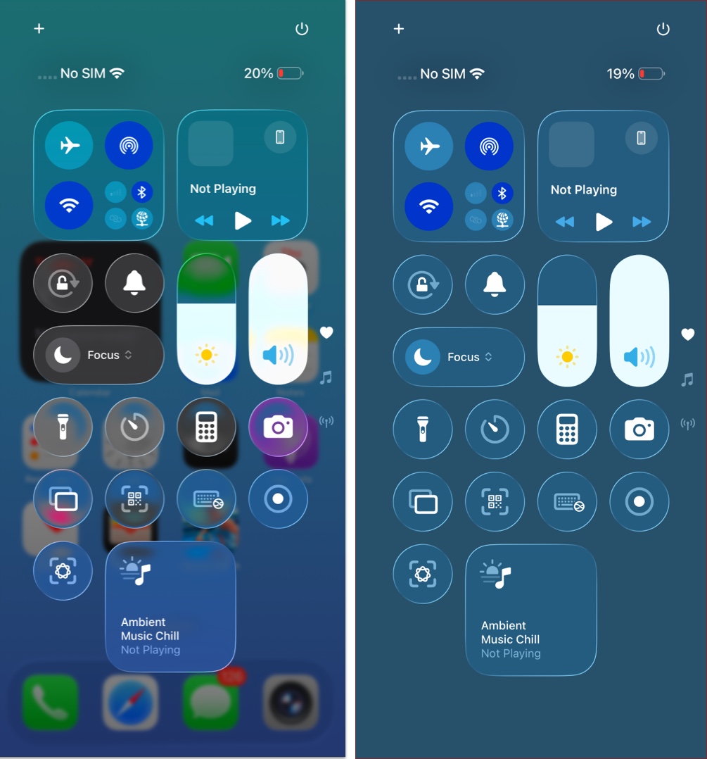
What This Actually Changes
Turning on Reduce Transparency doesn’t bring back the old iOS design. It’s not a full rollback. You’ll still see some of Liquid Glass’s flair, but in a more muted form.
- Makes UI elements like folders and menus less transparent.
- Boosts contrast for easier reading.
- Keeps the same layout and animations – just with more opacity.
Here are before and after images of Control Center, showing it before enabling Reduce Transparency and after enabling it.
Here’s how menus become more opaque, making them easier to read and navigate.
It’s a middle ground between the full Liquid Glass look and the older, flatter interface. It reduces the transparency just enough to make the UI less distracting and easier on the eyes.
How to Tone Down the Liquid Glass Look, Further
Reduce Transparency is just one option. If you want an even more dialed-back aesthetic, here are a few more things you can do:
1. Avoid Clear App Icons
iOS 26 now supports clear app icons and widgets. If you’re using them, here’s how to switch back to something less transparent:
- Long-press on the Home Screen.
- Tap Edit and then Customize.
- Select Default icons for a more traditional look.
- You can also choose Dark or Tinted options for better visibility.
![]()
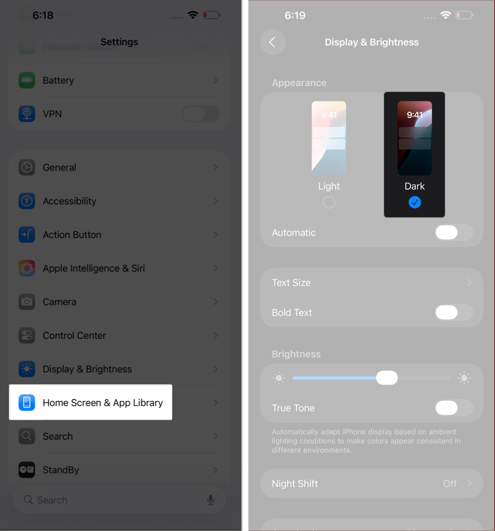
2. Use Dark Mode
Light mode amplifies the glossy effect. Dark mode softens it. You can apply dark mode by:
- Open Settings.
- Select Display and Brightness.
- Choose the Dark option under Appearance.
3. Use Solid Clock Style on Lock Screen
Your lock screen clock gets a glass look by default when you update it to the iOS 26. You can switch back to the solid color by:
- Long-press on the Lock Screen.
- Tap on the Customize option and then tap on the clock at the top to customize it.
- Now switch to the Solid option at the bottom.
- Adjust the font, color, and size of the clock according to your preference.
- Finally, close the clock editor and tap Done to save the Lock Screen.
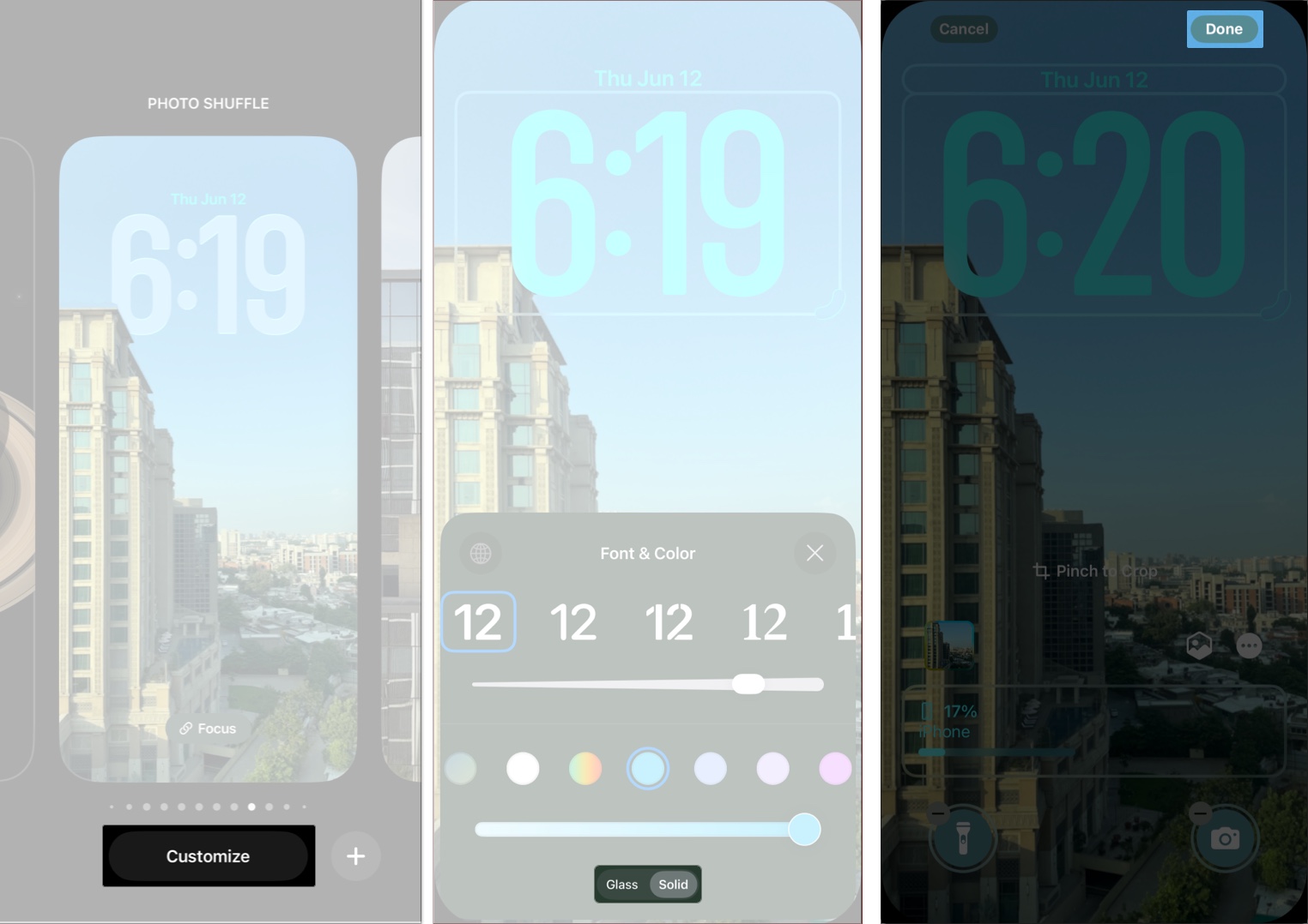
When customizing your Lock Screen, choose the solid-style clock instead of the glassy one. It boosts readability and keeps things grounded.
Together, these tweaks let you keep the modern feel of iOS 26 without dealing with the full intensity of Liquid Glass.
Liquid Glass Is Still Evolving
iOS 26 has officially launched, and Apple continues to refine the experience based on user feedback from the initial rollout. Future updates may include additional tweaks or new customization options to fine-tune the design even further.
Liquid Glass represents a bold new direction for Apple’s interface design, bringing the entire ecosystem under one unified aesthetic. But if the shine is too much right now, you have options.
You don’t have to avoid updating to iOS 26—just tone it down until it feels right for you.
Related articles worth reading:
Topics

Written by
Ravi Teja KNTSI’ve been writing about tech for over 5 years, with 1000+ articles published so far. From iPhones and MacBooks to Android phones and AI tools, I’ve always enjoyed turning complicated features into simple, jargon-free guides. Recently, I switched sides and joined the Apple camp. Whether you want to try out new features, catch up on the latest news, or tweak your Apple devices, I’m here to help you get the most out of your tech.
View all posts →More from How-to
How to Turn Off Location on Snapchat (Step-by-Step Guide)
Want to stop sharing your location on Snapchat? This guide explains how Snapchat location sharing works and shows simple ways to turn off your location using Ghost Mode or phone settings. Stay in control of your privacy in just a few steps.

Snapchat Parental Controls: How to Set Up Family Center and Keep Your Teen Safe
Snapchat’s Family Center lets parents monitor their teen’s friend activity and screen time without reading private messages. Here’s how to set it up and what to expect.
How to Block and Unblock Someone on Instagram
Instagram lets you block or unblock someone in seconds. Follow these simple steps to take full control of your privacy and online peace.