iOS 26 Beta 3: Everything New and Improved So Far
Apple’s iOS 26 beta 3 brings subtle but impactful changes—including Liquid Glass refinements, new wallpaper colors, app icon tweaks, smarter Apple Maps, and more.
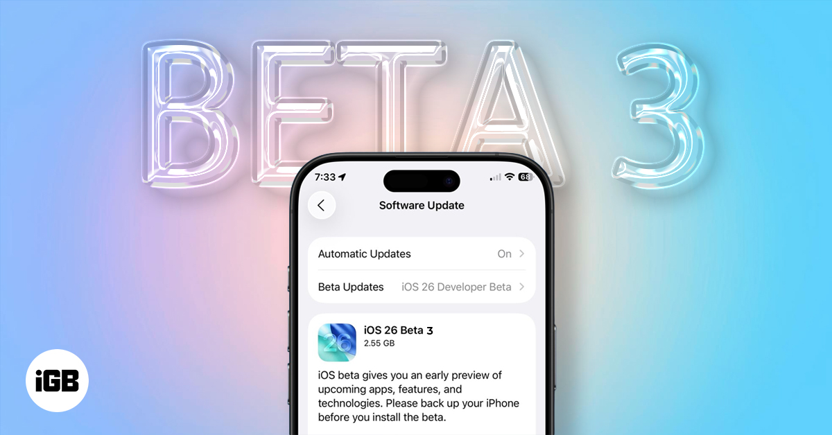
Apple just released iOS 26 beta 3 for developers, and while it doesn’t introduce groundbreaking features, it delivers a series of thoughtful refinements that improve usability, enhance the Liquid Glass interface, and add polish to your daily iPhone experience.
Here’s a complete breakdown of everything new in iOS 26 beta 3, so you know exactly what to expect.
Apple Refines the Liquid Glass Aesthetic
When Apple first introduced the Liquid Glass design in iOS 26, the translucent, glassy interface quickly drew attention. Many users admired its futuristic look, but others found it too transparent, making on-screen text and buttons difficult to see.
With beta 3, Apple appears to be listening.
- Navigation bars in core apps like Apple Music, Podcasts, Safari, and the App Store are now more opaque. This adjustment helps buttons stand out, making them easier to tap and more visually accessible.
- Notifications now feature darker backgrounds, ensuring better contrast and improved readability, especially on custom or colorful wallpapers.
- In Apple Music, the navigation bar no longer fully exposes album artwork behind it. Instead, it uses a less transparent background, reducing visual clutter.
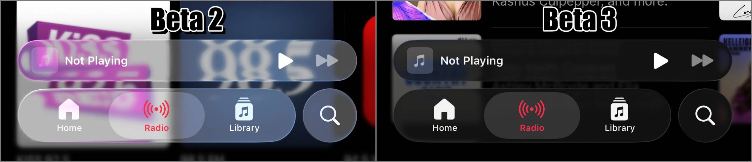
While some users feel that Apple has toned down the design a bit too much, this move signals a clear intent to strike a better balance between aesthetics and usability.
New Wallpaper Color Variants
If you enjoy personalizing your iPhone, iOS 26 beta 3 introduces new wallpaper color options based on the default design:
- Sky – The original default blue.
- Halo – A softer blue tone.
- Shadow – A deep, dark blue.
- Dusk – A striking blend of pink and purple.

Each of these wallpapers also adapts when Dark Mode is enabled, adding a fresh and dynamic vibe to your iPhone’s Lock and Home screens.
Dock Alignment Bug Fixed
A small yet frustrating bug in earlier betas caused the Dock icons to align to the left when fewer than four apps were present. iOS 26 beta 3 fixes this issue by centering the icons, restoring symmetry to your Home Screen.
This minor tweak goes a long way in maintaining Apple’s signature clean and consistent look.

Subtle App Icon Enhancements
Apple continues refining visual elements in iOS 26 with subtle app icon tweaks:
- The Photos app icon now features slightly more saturation, improving visibility, especially at smaller sizes.
- The Files app icon displays a deeper purple gradient, creating better contrast on lighter backgrounds.
Brighter Toggles in Control Center
iOS 26 beta 3 makes small but noticeable color adjustments in Control Center. Toggles for Wi-Fi, Bluetooth, AirDrop, and Cellular now appear brighter and bolder, improving visibility and aligning better with the updated system color palette.

Apple Maps Gets Smarter
Even without an internet connection, Apple Maps in iOS 26 has become more intelligent:
- Fog advisories now appear in offline mode, warning you about low visibility along your route.
- Commute delay alerts have been improved to offer more timely and accurate insights.
These updates aim to help users navigate more safely and efficiently, whether they’re connected or not.
Safari Folder Design Polished
Safari also receives minor design updates to its folders interface. The folder layout now better matches the Liquid Glass aesthetic, with enhanced readability and cleaner visuals that feel more refined and easier on the eyes. You can check out all the new Safari features in iOS 26 and macOS Tahoe for a deeper look at what’s changing.
iOS 26 Public Beta Launch Timeline
Apple has confirmed that the iOS 26 public beta is set to launch in July, following the release of developer beta 3. If you’ve been holding off because you don’t have a developer account, your chance to try out iOS 26 is just around the corner.
For now, people are divided on the current update. Some users are happy that readability has returned and the device feels easier to use, while others dislike that it rolled back the new redesign. A few are even joking that Apple should rename it from Liquid Glass to Frosted Glass due to how muted it looks now.
Don’t miss these related reads:

Written by
Ravi Teja KNTSI’ve been writing about tech for over 5 years, with 1000+ articles published so far. From iPhones and MacBooks to Android phones and AI tools, I’ve always enjoyed turning complicated features into simple, jargon-free guides. Recently, I switched sides and joined the Apple camp. Whether you want to try out new features, catch up on the latest news, or tweak your Apple devices, I’m here to help you get the most out of your tech.
View all posts →More from News
macOS Will Flag the Slower USB-C Port on MacBook Neo
The MacBook Neo includes two USB-C ports with different capabilities. The left port supports faster speeds and external displays, while the right port is limited to USB 2 speeds for charging and basic accessories.

Apple Launched Studio Display and Studio Display XDR: Full Specs, Features, and Price
Apple launches Studio Display and Studio Display XDR built for creators with Thunderbolt 5, stunning visuals, and pro-level performance. Here’s all the specs, features, and price.

Apple Pre‑Orders Now Live for iPhone 17e, MacBook Neo, M5 Macs and More
Apple has opened global pre-orders for iPhone 17e, MacBook Neo, M5 Macs, and new Studio Displays. Here are the start times, products, and release date.