
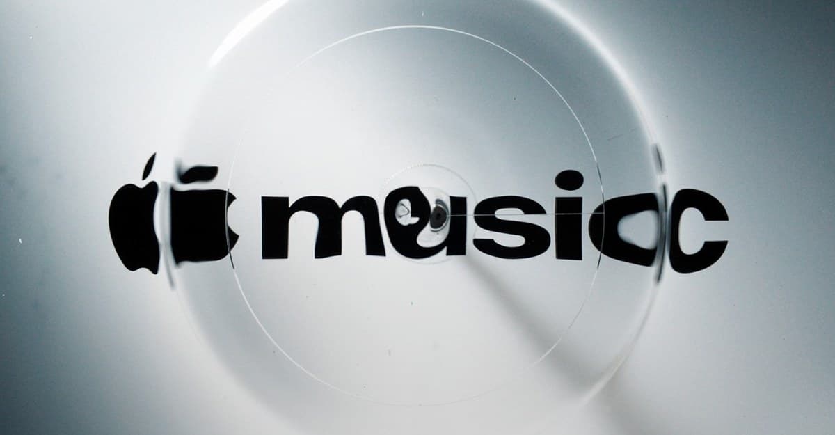
Apple Music has unveiled a new brand identity, with a redesigned wordmark, musical-note imagery, and an original composition by Fred again.. and NEST Acoustics. Apple calls it “made by sound,” and this time the branding slogan comes with a fairly convincing science demonstration.
The team played musical frequencies through a rig, used the vibrations to move liquid, and filmed what happened to the Apple Music graphics underneath. The ripples and refractions became part of the new look. Somewhere, a perfectly serviceable logo-design brief turned into a physics experiment. I’m glad it did.
Fred again.. helped write the music that shaped the visuals
Apple’s behind-the-scenes film follows the process from sound to moving image. Individual notes create physical vibrations, which send waves through the liquid and distort the brand elements seen through it. Change the sound and you change the movement on camera.
Fred again.. and NEST Acoustics supplied the original composition behind that movement. It also gives the identity its own short musical signature, so the sound and animation belong together from the start. That’s a fitting approach for a music service: let the musicians influence what the thing looks like, too.
Apple says the visuals were captured entirely in camera. The glassy edges and shifting colors have a physical source, which makes the film more interesting than another animation that simply tells you a logo is exciting now. You can see the process in Apple’s video below.
The new wordmark has personality. But we’ll still miss the red branding on Apple Music
The Apple symbol now sits beside heavier, tightly packed lowercase “music” lettering. The musical note also gets a more expressive treatment, with the announcement showing it surrounded by liquid-like edges and flashes of color.
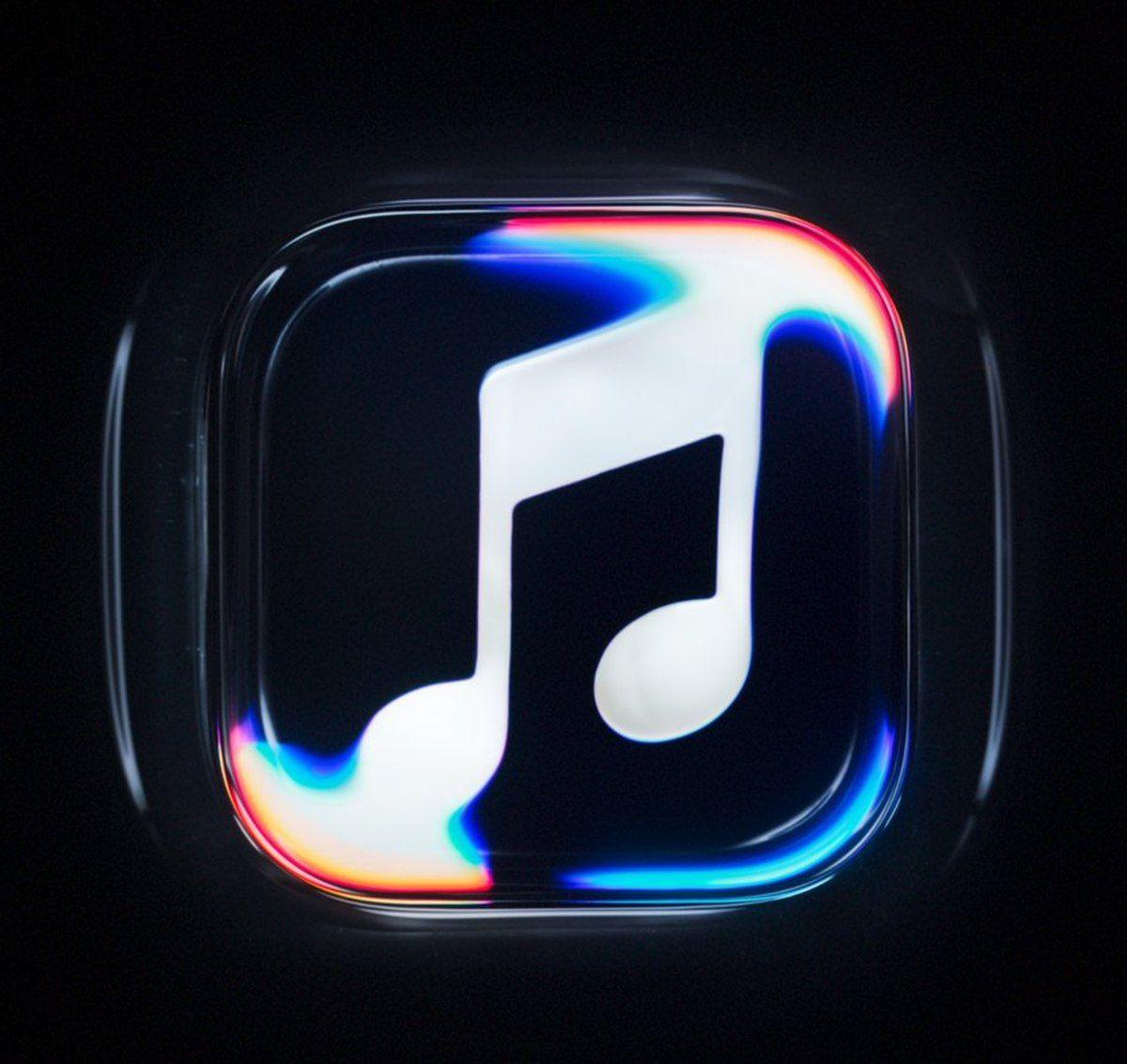
The wider shift toward black-and-white branding is more divisive for me. The old red gave Apple Music an immediately recognizable spot among your apps. A monochrome icon has to work harder to stand out beside all the other monochrome icons. Apparently, every app wants to wear the same outfit now.
The moving identity is where this redesign makes the strongest case for itself. Light bends around the note, colors appear at its edges, and the wordmark ripples with the composition. Those effects fit neatly into Apple’s broader Liquid Glass design language, while giving the music service an effect built around its own subject.
Apple has already paired a media rebrand with a musician through Apple TV’s new identity and Finneas sound. Fred again.. and NEST Acoustics give Apple Music its own version of that audiovisual introduction. A streaming service’s identity now apparently needs credits. At least these credits explain something worth watching.
The branding is official; the app rollout is still catching up
Parts of the refresh appeared during the iOS 27.2 beta cycle, including a black-and-white Music app icon. Those early app changes and the newly announced identity are parts of the same refresh, although the promotional animation and the small Home Screen icon serve very different jobs.
Apple’s launch post doesn’t give a complete platform-by-platform rollout schedule. If your devices still show the older branding, that alone doesn’t mean anything is broken. I’d wait for the normal software updates rather than install a beta to acquire a different-colored musical note.
This announcement is about the service’s look and sound as a brand. It doesn’t announce a new listening feature or subscription benefit. I like the craft behind it; the songs still have to do the rest.